
Fear not, because Book Spotting is back in its fourth installment, and there are still plenty of wonderful covers crossing the desk here at Biblioasis every day. But absence makes for good cardio, or something to that end, right?
In case you missed the covers more than the rambling, I'll move on now to the pretty pictures:
Woes of the True Policeman by Roberto Bolaño
(Farrar, Straus and Giroux, 2012)

These sort of hand-drawn, primarily typographic covers have been really catching my interest lately, as evident in a few of the designs I've been working on myself. Maybe it's because I recently was gifted a graphics tablet and getting used to it has me drawing in the style of a five-year-old, but this sort of low-fi aesthetic, combined with a sensible use of white space and a pop of colour really draws me in. I like that the "author of..." line seems added in like a marginal note (and its placement contributes to that as well), and the type itself is irregular enough that it avoids looking like an overly flattened "handwriting" typeface instead of actual handwriting. The matte finish of the cover adds to its understated charm.

Strap Hanger by Taras Grescoe
(Times Books, 2012)
Now, I know that gushing over the design of this book is nothing fresh. In fact, I've seen this one on multiple "best of" design blogs this year, but rightly so. I may be treading on old ground here, but this design deserves the credit. The subway map aesthetic is iconic. Bright colours, clean lines, circles, white space, clear text. I'm sure whole books can (and have?) been written on the design merits of subway maps. The designer here draws on that iconography and creates something equally clean, clear, colourful and striking that speaks to the topic of the book without entering the realm of the literal. I love the idea of borrowing a well-known aesthetic to represent a concept as opposed to going straight for an image or a photograph that can stand in for it.
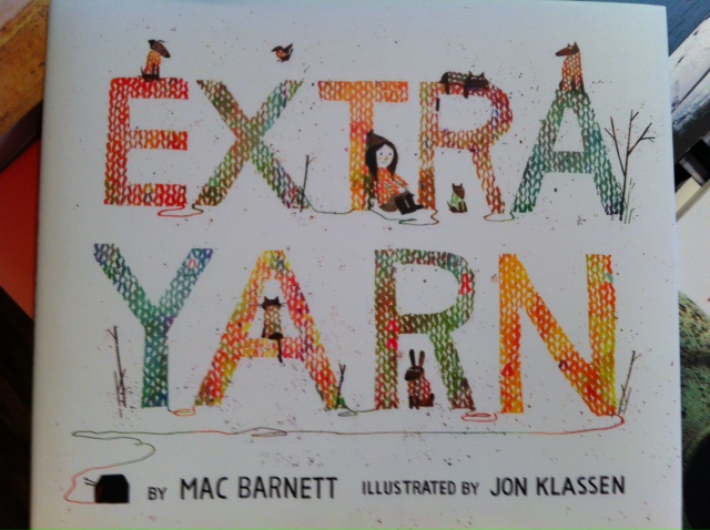
Extra Yarn by Mac Barnett, illustrated by Jon Klassen
(Balzer and Bray, 2012)
I thought it was time I talked about another book from our children's section, and this one is certainly deserving of some attention. Extra Yarn is one of the most beautifully illustrated and designed children's books I've seen in a long time. As the cover goes to show, the illustrations have a wonderful texture and depth about them, with the title taking on the look of knitting. The yarn, the animals, and the title all come together seamlessly (pun not really intended) with the snowy backdrop, and there's a flow through the loose strands of wool that draws the eye across each word and down to the author and illustrator information. The cover alone can't really do this one justice as the entire book has a really classic children's book feeling about it. It feels wholesome and warm like a wonderful hand-knit wooly sweater.

1Q84 by Haruki Murakami
(Vintage, 2013)
What really caught me about this book, beyond just the striking cover image (because there are striking images of striking faces on the covers of a lot of novels), was the texture and use of matte and gloss with the typography. It's a bit tricky to see in a photo, but the cover is matte with the exception of the glossy and bright chunky text of the title. This gives the book the impression of being behind a piece of foggy glass with small pockets of clarity. The typeface is thick and simple enough to lend itself to this sort of a treatment, and the subtlety of the colours means that the extra large text doesn't compete with the central text of the author's name. The touch of bright pink from where the lips cross the title, and having both eyes within the gloss segments gives the book a punch of colour and an intensity that wouldn't be there if the placement were different. This is one of those books that catches your eye on the shelf in the most literal way possible.
Only four for issue four, but keep your eyes on this space for more Book Spotting soon!
No comments:
Post a Comment