Thursday, January 17, 2013

Book Spotting 2: More great covers in the Biblioasis shop

It seems as though every time I walk into the Biblioasis storefront, I get sidetracked from my task at hand by my need to examine some new book cover or layout. Useful when my task at hand is to grab a cookie or a chocolate. Perhaps not so useful when I can no longer remember what it was I was supposed to pack up for the mail run.

Given my inability to resist an attractive book cover, I've come up with a few more recent favourites to share with our Bibliofriends, all of which are, at the time of writing, available for purchase in the shop (so stop by and pick one up would you?)

 May Day by F. Scott Fitzgerald (Art of the Novella Series, Melville House Books, 2009)

A couple books in this series came in a little while ago (the other was Joyce's The Dead, same format but an attractive grey background instead of pink) and I was struck by the clean simplicity of the design and the quality of the execution. This is the kind of design that makes people want to re-buy books they already own, just to have the matching set. It's not enough for a series just to match; they have to be interesting and beautiful as well, and this set accomplishes that as far as I'm concerned. In fact, there are 43 books to date in the Art of the Novella collection, all with the same basic typesetting and layout, but each with a striking different colour, and I imagine they'd all look quite nice lined up together on a bookshelf.

    
 In Praise of Messy Lives by Katie Roiphe (The Dial Press, 2012)

While I haven't read Roiphe and most of what I've read of her has been the controversies around her work in the '90s, I can't deny the appeal of the cover of her latest book In Praise of Messy Lives. It reminds me a lot of another book cover I love, loneliness by John T. Cacioppo & William Patrick. While Norton may have done it before Dial, the shifting of the dots on the letter "i" is subtle and quite lovely. I admit, I like typographic covers. I like minimal designs. And reflecting "messy" in slightly misplacing the dots on the letter "i" on a book cover is a messy I can get behind. Changing the colour of the dot on "Lives" is a nice touch as well.


Straight Razor and Other Poems by Salvatore Ala (Biblioasis, 2004)

I remember seeing this title at Windsor's BookFest years back and thinking it was the most attractive book being sold. Amongst hundreds of others, this one stood out, and for good reason. Yes, I know it's a Biblioasis book so of course I'm going to praise it, but in the spirit of full disclosure, this book came out eight years before I joined the staff so I think my assessment of it still counts. Classic type treatment, crisp white background, a well-photographed image that is striking all on its own and a hint of shadow (no, not the shadows from my poor photographing of the cover, the shadows on the razor), to give the image depth. To this day this is one of my favourite Biblioasis covers.


Shakespeare's Tremor and Orwell's Cough: The Medical Lives of Famous Writers 
by John J. Ross, M.D. (St. Martin's Press, 2012) 

Finally, this book has a bunch of design elements that I think are really working. The silhouettes, especially the more recognizable one of Shakespeare at the top are clean looking and give the book a contemporary yet traditional feeling. The bright orangey colour, contrasted with sparse black and white and a touch of teal on the subtitle catches the eye and is a bit unexpected. The handwritten typeface surprises me, because usually I can't stand script fonts. This one is somewhere between a schoolroom handwriting type and a more formal script, and coupled with the lines from Shakespeare's quill, it makes sense. Orwell coughing up typewriter letters (they're tiny, I know, and hard to see, but they are typewriter letters) is fantastic, tying the body into the writing process in a physical way. Great idea. Finally, possibly my favourite aspect of this cover is the way the designer incorporated the subtitle and author's name onto a file folder. It's subtle, it's clean (see a trend happening here with my design-related praise?) and it's a clever way to add some contrast and make this text stand out without having people wonder, why is there a stripe down there for no reason? 


More beautiful books to come in the next installment of Book Spotting. 
Feel free to comment with your favourite designs!

Monday, January 14, 2013

Alice Petersen on 12 or 20 questions

rob mclennan's "12 or 20 questions" blog feature has become a fixture in Canada's literary conversation, giving readers a look inside the writing lives of Canadian authors.

This month, Alice Petersen, author of the QWF winning short story collection All the Voices Cry, took on questions about the smells that remind her of home, and her reaction to seeing her first book in print.

Read the full article on rob's blog, here.

Book Spotting: Tracking Great Design at the Biblioasis Shop

Happy Monday Bibliofriends!

Because no one really likes Mondays (least of all our pal Bob Geldof), we've put together a special treat that will, with our best intentions, become a regular feature here on Thirsty.

As one of our resident typography nerds / paper lovers / book designers, I've started photographing the most striking book designs that I come across in the shop. These are books I pick up and think, "wow, what a fantastic idea" and then spend a few hours grumbling about how I wish I had thought of it first. They are books that use type, image, paper stock and a variety of other elements to grab my attention and remind me to consider design differently next time I sit down at the computer.

As we have a wealth of beautiful and well-designed books coming through the doors every day, I have an abundance of material with which to bombard our kind readers.

For now, I'll restrain myself and limit my post to a few covers I've been admiring lately (all of which are, at the time of blogging, available in store at Biblioasis):

Carnival by Rawi Hage (House of Anansi, 2012)
This one may be a bit obvious, but I couldn't leave it out of my post just because so many "best book designs of the year" lists have included this cover. Designed by Brian Morgan with illustration by Lorenzo Petrantoni, this cover is complicated without confusing the eye. The kaleidoscopic feel is at once chaotic and extremely well-ordered and balanced. The red and blue on the white background, combined with the overlap of semi-transparent images add to the optical illusion effect, giving the impression of some sort of 3D without the glasses that tie everything together. Plus, the choice of images is intriguing enough to make me wonder what spiders, cars, and guns have to do with the novel, which, by book cover standards, sounds like a success to me.

 
Building Stories by Chris Ware (Pantheon Books, 2012)
 When this "book" (more accurately a set of books, pamphlets, and newspapers, among other exciting bits of ephemera), arrived in the shop, the entire Bibliostaff stopped what we were doing to take a closer look and open up our display copy. Packaged in a large box (pictured here), Building Stories is a like a graphic shuffle text on an extreme scale. When you open the box, you find tiny comic strips bound in miniature book form, full-sized newspaper fold outs, maps, pamphlets and other "book objects" (14 in total). These can be read and experienced in any order and, with their forces combined, create a sprawling, non-linear plot. Not only is this a super ambitious project, the execution is impeccable. The art is striking and colourful but also at times sparse and quiet, and the production values on this set are high. Everything in the package is clean, crisp, and neatly put together for an experience that makes opening the box and examining its pieces part of the fun of following the story.


 Ariel by Sylvia Plath (Faber, 2010)
I bought this edition of Ariel when I was studying it in a grad class a couple years back despite owning several copies of the text already. And why? Because it is a truly gorgeous edition of the book. The matte illustrated cover in white, teal and black definitely has Faber's signature all over it, and that is not a bad thing. It is busy, when I usually favour simplicity and clean lines, but the way the images flow together along with the minimal colour palette make this a cover that really stands out. Beyond the cover design, the book feels great to hold. It's a sturdy little hardcover that feels like it will last long enough to read, re-read, re-read again and maybe pass along to someone else twenty years from now.

Fairy Tales from the Brothers Grimm by Philip Pullman
A bit of a change of gears here, as this one caught my eye in the children's section. Although, there's something about this cover that, while it is clearly a children's book, with its traditional fairy tale characters and soft landscape, suggests a maturity and darkness that certainly exists in fairy tales. I think my favourite aspect of this is the interaction of type treatment and image. The way the ominous black birds sort of cut in and out of the text really brings the two design elements together, while at once keeping the book from appearing too soft and sweet. The type treatment alone is also quite contemporary and stark, not something we often see on a children's book, but in this case, it works. The designer has pulled together a cover that makes sense for fairy tales, stories we've told to children for hundreds of years, with an underlying darkness that adults will even find a bit chilling. 

The Blondes by Emily Schultz (Doubleday, 2012)
Again, this one has appeared on quite a few "best of" lists for book design this year, but with good reason. I am a sucker for a repeated but slightly altered pattern. I like symmetry and grids. But I also know that without the right treatment, these elements can come off a little flat. Not so with the design for The Blondes. Though it may be hard to tell from my instagram photo here, the swatches of hair are gloss, while the rest of the cover is matte. Just this choice takes the repeated pattern to a completely other level in terms of visual interest (and texture, when you run your hand over the cover). The distressed almost daytime sky background gives a sense of erosion and falling apart, but the colour choice also suggests (at least to me) a sort of typical happy suburban film set, where the sky is always bright blue. Changing the colour of the hair from blonde to a selection of multi-coloured jewel tones as the blue fades to brown gives the impression that while things may seem pretty normal and together, that feeling is not going to last. Pair this great visual with a clean and plain typeface that doesn't compete for attention, and you've got one of the best covers I've seen all year.

More to come in the next Book Spotting!

Saturday, January 12, 2013

Bookish Types Wanted to Join Exclusive Holy Order

“Zounds!” was the cry that so oft arose from the weeping crowds. What a melancholy crop you were in those days! We remember how you paced, scarlet-cloaked, dusty-footed, moaning your oh miseries and your alacks, your well-a-days and woe-betides, as you trod in endless weary circles around the Bibliomanse. How you bathed with tears the shrubbery. How you polished the air with your sighs! How you verily swooned to glimpse the tender heels of chaste maid Fiction, and how you jockeyed amongst yourselves for glance of Poesy’s ever-burning brow! 
Such is the pain, we gather, of standing before the gate. Of peering in. Of wondering what, by Jove, goes on at Parnassus’s peak, at Olympus’s high table, or even (almighty Zeus!) in the Biblioasis back office. But stopper your tears, beloveds, and lay waste your sighs, for this year the gates shall open and the trumpets ring forth! Either purchased by dint of hard coin or spun by the sweat of your brows, the most devoted among you shall claim appointment to a Sacred and Holy Order, to be known henceforth as
THE BOOK FELLOWS, or
THE BIBLIOASIS BOOK FELLOWS, or
THE BIBLIOASIS BOON FELLOWS (for the archaic), or
THE BBFs (for short).
Boon: an adjective (close, intimate, favourite) from the Middle English (jolly, congenial), in turn derived from the Old French (bon) and the Latin (bonus, good).  A boon fellow? A favoured colleague. A privileged peer. In essence, a knight of the realm.
Upon their induction all Book Fellows shall receive:
Heraldic buttons and ensigns
Swag and bounty of indescribable richnesse
A Yuletide gift item, exclusive to BBFs,
A 20% discount on all backlist orders, and
—most crucially—
New Titles, of a type of their choosing,
in advance of publication,
SUBSTANTIALLY DISCOUNTED.


How does it work, gaspeth the crowd. AttentionEcoutez-moi!  

Become a BBF: Order Your Subscription Today!

Biblioasis is now offering several subscription packages in order to help you save a little money on what, let's face it, you're probably going to buy anyway. (Yes? Yes?) The subscription plan allows you to purchase a whole year's worth of fiction (or poetry, or translation, or non-fiction) for a single flat fee. All set prices are based on our average yearly output at a 40% discount, with shipping included.* Plus you don't pay tax! 
  • $125.00/year: receive all Biblioasis new fiction releases (7/year)
  • $80.00/year: receive all Biblioasis new non-fiction releases (5/year);
  • $50.00/year: receive all new poetry titles (3-4/year);
  • $32.00/year: receive all new Biblioasis International Translation Series titles (2/year);
  • $250.00/year: receive the entire year’s worth of books (16/year).
*There may be a small surcharge for international or overseas shipments.

You can purchase subscriptions for yourself or as gifts for friends. Email info@biblioasis.com to discuss the package that's right for you. Combinations are available. Plus, as a thank-you gift for ordering, you'll receive a free copy of Biblioasis's Book of the Month

Wednesday, January 09, 2013

Ray Robertson in the Border City and Beyond

One of Canada's most acclaimed novelists, Ray Robertson, will be heading to the border city next month for the writer-in-residence gig at the University of Windsor.

With a view of the iconic Detroit skyline, UWindsor seems an apt place for Ray's brief tenure, as his latest novel, David, is now available in the U.S. for the very first time.  

David, which follows the life of the eccentric title character, born a slave in the mid-1800s and living as a free man and saloon keeper in Chatham, Ontario, is now also available for the first time in paperback in Canada and the U.S., and has been receiving a great deal of positive attention since its re-release by Biblioasis this winter.

Library Journal wrote, "This beautifully written novel with its discontinuous narrative, complex characters, and references to poets, philosophers, and other great thinkers is a challenging read that is well worth the effort. Although Robertson (Home Movies; Heroes; Moody Food; Gently Down the Stream) has won many Canadian literary awards, his work is unfamiliar to American readers. With this novel he has beautifully brought to life a segment of African-American history that is largely unknown in this country."

If that tickles your fancy and you're in the Windsor area in February, look out for a few Ray Robertson events (details to come!) in the city.


Interesting New Books

For a more-exhaustive-than-most, focussed-on-the-international-with-a-penchant-for-the-heady-postmodern-and-complex list of exciting reads for 2013, I'd point you towards Scott Esposito's Interesting New Books list for 2013. Just up on conversationalreading.com. And oh? What's that there in January? Is that Mia Couto? Yessir: The Tuner of Silences is just off the presses and will be trundling across the continent any day now. Keep an eye out for this Important and Gorgeous book in stores near you.

Wednesday, January 02, 2013

It's a whole new year ... but we're up to the same old malarky.

Good morning, bibliobustlers, bibliohustlers, and welcome to 2013. Lots of stuff from the Oasis coming up for you this month: subscription plans (oh yes! so cheap!), January's newsletter (hey you! sign up!), some fan-tabulous previews from our spring list, and goodness knows what else. But before we get into all that we have two final tips of the hat from 2012, both doffed at—yes, you guessed it—Malarky. When Brian Francis was asked by the CBC's Year-in-Review committee which Canadian author made the biggest splash this year, guess who he picked? (Okay so first he picked Tanis Rideout, but then he picked Our Woman. You can read about it here.) Then not a day later Ian McGillis and our good friends over at the Montreal Gazette listed Malarky on their Rewind 2012 panel, declaring: 
"Anakana Schofield’s Malarky introduced an indelible heroine into our national literature, no less so for the fact that she’s Irish. Inhabiting the sometimes confused but always indomitable mind of the grieving and randy Dublin housewife Our Woman, Schofield has created a note-perfect literary joyride, a “voice novel” in the best sense. An unaccountable collective oversight saw Malarky left off all the major prize short lists, but Amazon and other Internet indicators show that Irish-Canadian Schofield is finding readers regardless, and that’s as heartening a story as 2012 has provided."
Heartening indeed. It was a good year. More soon, my friends. With love from blustery Windsor-town.


Friday, December 28, 2012

The Best Reading of 2012: The Toronto Star


Well the press offices have officially gone dark for a couple of days, but we're re-emerging for just a second with a little Christmas candle: yesterday both Alice Petersen's All the Voices Cry and Anakana Schofield's Malarky were listed as two of the Toronto Star's Best Books of 2012. Congratulations to Alice and Anakana, a Merry Boxing Week to those of you braving the crush, and a very happy new year to you all. Peace and love (and good reviews!),
Tara.


Malarky by Anakana Schofield 
"Unaccountably overlooked by this year’s prize juries, Anakana Schofield’s ribald story of an Irish farmwife’s descent into late-life cougardom and mental breakdown is a standout debut and one of the best Canadian novels of the year: the sort of book that forces you to read it over again as soon as you finish."

All the Voices Cry by Alice Petersen
"Why does Canada produce so many great short story writers? For the record here’s another. Alice Petersen’s first collection reads like the work of someone who is already a master of the form, her writing dense with understatement, subtlety and ambiguity."

Monday, December 17, 2012

Everybody That Matters and Then Some

"According to everybody that matters," wrote Kerry Clare yesterday, "this was one of the best books of the year, and when it comes out in the UK next year, the whole world is going to know it."
High praise indeed. And it's a good excuse to revisit an exciting piece of news that might have been overlooked in the year-end recap of last week: British rights to Malarky have been purchased by Oneworld, who will be releasing a UK version of the novel in 2013. This is in addition to the half-dozen best-of lists that Anakana's topped in the past month, including three new ones this weekend:
The plaudits keep on coming, but Michael Hingston at the Journal may have said it better than I could. I'll leave you with his comment. My congratulations to Anakana once more.
Great fiction takes risks. That's why descriptions of a classic and an utter fiasco can sound so similar. And yes, in theory, the debut novel by Vancouver's Anakana Schofield is far from a sure thing: it's an obsessive, voice-driven novel about a grieving Irish housewife that runs along irregular timelines and lingers at unusual places. It also never, ever apologizes for itself. More importantly, it all works. Joe Biden may have done more to repopularize the word "ma-larky" this year, but Schofield's electrifying novel will leave a much longer impression.

Wednesday, December 12, 2012

Daubers Press Exhibit & Reading: Dec. 14-Jan. 6


This just in from Amanda Jernigan. If you're in the neighbourhood, stop in. Their broadsides are beautiful.

- - - - - -

Dear friends and family --

John and I will be having a small exhibition of our Daubers-Press collaborations at the Sylvia Nickerson Studio (126 James St North, 3rd floor), opening during December's art crawl: Friday, December 14th, from 7 - 11 p.m. Please drop by for a mug of mulled wine, to help us celebrate. (I'll be giving a brief poetry reading at 7:30 p.m.)

For those of you who don't know, Daubers Press is the private press imprint under which John and I have issued a series of letterpress-printed pamphlets and broadsides, usually featuring a poem of mine and a photograph of John's -- sometimes a wood-engraving. Many of these have been holiday keepsakes, issued in small editions and distributed to family and friends. Sylvia Nickerson has been a collector of these keepsakes since the early days, and it is at her generous behest that we have chosen to gather the full run for this Christmas exhibition.

A poster is attached. Feel free to distribute, to others who might be interested.

With warm wishes from us all --
Amanda, John, Anson, & Ruby


Tuesday, December 11, 2012

2012 in Review

As we were putting together the latest edition of The Draught, we at the Bibliomanse decided it would be fun to hop on Wagon Retrospect. Reflect a little on the accomplishments of 2012. Tip our hats to the authors and readers who make each year exceptional, perhaps say a few words to all of our new friends here in Windsoria (all of whom, by the way, we're delighted to see so often at 1520 Wyandotte East). Thirsty can never quite cover all that we do over here, and you only see so much from the storefront: we thought we'd try and bring you more of the story. Or at least a plot synopsis. A cover letter? Biblioasis for Dummies? Filemaker Made Easy? (Oh wait. Those last two are for me.)
Um. Without further adieu …  
THE YEAR IN REVIEW

We have a lot to be proud of in our little corner of the world. We’ve won awards, we’ve been written up warmly, and of course our new storefront was greeted with great enthusiasm by both the Walkerville community and Windsor at large. Yet—and as we hope will always be the case—our primary accomplishment remains the publication of stupendous authors. This year saw new works by Mark KingwellDouglas GloverMarty GervaisLiliana Heker,David HelwigNadine McInnisAlex BoydJessica HiemstraNorm SibumMike Barnes, and C.P. Boyko. Our stable continues to boast titles by Caroline Adderson, Clark Blaise, Charles Foran, Mavis Gallant, Annabel Lyon, John Metcalf, Alexander MacLeod, A.F. Moritz, Eric Ormsby, Ray Robertson, Seth, and Guy Vanderhaeghe.This year we’re especially proud to have added two books to our collection of astonishing fiction debuts: Anakana Schofield’s Malarky, which was selected for the extremely competitive Barnes & Noble Discover Great New Writers program in 2012, and Alice Petersen’s All the Voices Cry (winner of this year’s QWF First Book Prize). As followers of theThirsty blog will know, Anakana's coverage this year has been exceptional, and we're happy to say that UK rights toMalarky were just sold to Oneworld; with a little luck her plaudits will continue long into 2013. We're also downright tickled about Alice, who it seems was only yesterday delighting audiences from Windsor to Montreal.


2012 saw Biblioasis authors win the Canadian Author's Association Award for Poetry (Goran Simic) and the City of Hamilton's Bryan Prince Award for Poetry(Amanda Jernigan,who was also shortlisted for the Pat Lowther). We had invitations to the Brooklyn Book Festival, WordFest, Winnipeg’s Thin Air, Blue Met, VIWF, IFOA, and Portland’s Wordstock. Both Malarky and C.P. Boyko’sPsychology made the Amazon.ca Editor’s Picks list for 2012, and Douglas Glover’s Attack of the Copula Spiders appeared in the Globe Top 100 column and was praised in the Wall Street Journal. We’ve had multiple features in each of The National Post, The Globe & Mail, The Vancouver Sun, and The Montreal Gazette, as well as American reviews in The New York Review of Books, The Economist, Reader’s Digest andThe San Francisco Chronicle. This builds upon the recognition our press has received in previous years (including shortlists for The Giller Prize, The Rogers Writers’ Trust Fiction Prize, The Hilary Weston Writers’ Trust Award for Nonfiction, The Red Maple Award, The Winterset Award, The Danuta Gleed Award, The Archibald Lampman Prize, the B. C. Award for Canadian Nonfiction, the Relit Prize, The Frank O’Connor Award, a Commonwealth Award, the Thomas Head Raddall Award, and much else). We’re happy to say that critical recognition for Biblioasis titles is growing.


On the whole in 2012 Biblioasis made exceptional contributions to its fiction, non-fiction, and poetry lists, and we continued our mandate to publish exciting new authors. As Thirsty readers are by now extremely aware, for a debut novel Anakana Schofield’s Malarky received overwhelming attention, both for the exceptional nuance of its voice and the extraordinary likability of its protagonist. “Schofield starts at a pitch of inspiration most novels are lucky to reach at any point,” observed The Montreal Gazette, “and remarkably sustains that level all the way through”: her 20+ other reviewers largely agreed. So did the selection committee at Barnes & Noble Discover Program (“it was the voice that got me,” commented Program Director Miwa Messer); “Quirky, raucous, and utterly unconventional,” said Reader’s Digest. And a contingent of elite online bloggers (including Ann Kjellberg of the New York Review of Books, Kassie Rose of NPR, and Scott Esposito of Quarterly Conversation) have called it everything from “a miracle” to “the most engaging storytelling ever encountered.” Now, approaching 9 months after publication, Anakana has been to many of the premier festivals in North America (including Brooklyn, Portland, IFOA, VIWF, and Victoria), and continues to receive invitations to speak in her home province.     
Yet Malarky isn’t the only one of our fiction titles to be well-received this year: Alice Petersen’s All the Voices Cry, edited by John Metcalf, was another remarkable debut, lauded for its facility with metaphor and (how many times can we say it?) awarded the QWF First Book Prize. And this fall we published the sophomore collection of Journey Prize-winning short story writer C.P. Boyko, glowingly commended in The National Post, The Toronto Star, Quill & Quire, and The Winnipeg Review. All three books had covers by Gord Robertson of Toronto; the Boyko and the Schofield in particular have been praised for their striking geometric designs. We had a strong showing from Nadine McInnis (Blood Secrets), as reviewed in The National Post and the Ottawa Citizen; our paperback reprint of Ray Robertson’s David is perhaps one of the most attractive books we’ve done, inside and out; and last but certainly not least we had Mike Barnes’s The Reasonable Ogre, hailed by the leading American expert on fairy tales as “a marvel, and a tribute to the power of story.” Altogether our 2012 fiction list demonstrates our commitment both to exceptional style and the genre of the short story (Malarky being the only new novel).

In poetry we were proud to publish sophomore collections by Jessica Hiemstra and the Lampert Award-winning Alex Boyd; we also published a new collection by veteran Montreal author Norm Sibum, whose debut novel (The Traymore Rooms) is our lead fiction title for Spring 2013. (Yes, that’s the one presently clocking in at a monumental 800+ pages.) Both the collection and the novel treat on American imperialism in a way we find exciting, moving, saddening, and frightening by turns. Hiemstra’s book contains a fine selection of pen-and-ink drawings done by the poet (also a visual artist), and Alex Boyd’s book marks the first Biblioasis title to be typeset by our new production manager, Chris Andrechek. Both Sibum and Hiemstra saw substantial excerpting in The Montreal Gazette.

2012 was an exciting year for Biblioasis nonfiction as well. Our two local history titles (Marcel Pronovost: A Life in Hockey and Marty Gervais’s Ghost Road and Other Forgotten Tales of Windsor) have both proved immensely popular and are also valuable contributions to the local history of the Windsor-Essex region. They contain a wealth of archival photos and are meticulously researched. There was Cooking with Giovanni Caboto, herculean, gorgeous.There was the postponed-till-there's-a-hockey-season book on the Detroit Red Wings (and man is it a looker). Last but not least we were especially excited to publish two nonfiction titles from acknowledged experts in their  fields: Governor General’s-Award winning novelist and creative writing instructor Doug Glover released Attack of the Copula Spiders and Other Essays on Writing, and longtime philosopher Mark Kingwell made waves with Unruly Voices: Essays on Democracy, Civility and the Human Imagination. The essays of both books demonstrate Biblioasis’s ongoing commitment to the publishing of critical works about literature (or, in Kingwell’s case, the literary imagination). So far Mark Kingwell has been excerpted and interviewed in Harper’s, has seen several reviews (with one forthcoming in The Rumpus), and appeared twice on TVO’s The Agenda with Steve Paiken.

Altogether it's a year to be proud of and we want to thank our authors heartily for their hard work. You're what we do it for, ladies and gentlemen: a Merry Christmas and a Happy New Year to all of you from Biblioasis.

Monday, December 10, 2012

Malarky hits 2012 best-of lists

Malarky was singled out in The New Statesman's
Read-All-About-It list for 2012. Yup, that's it there.
To the left of the Acacia tree and to the right of the fire.
Morning folks, and happy Monday. Malarky's hit a few more best-of lists this past week, beginning with a shout-out in The New Statesman's Read-All-About-It section for 2012, where Jenny Diski called it one of her top three novels of the year, and remarked on its "notable style and imaginative power." What else? Malarky was also singled out on David Gutowski's Largehearted Boy's Top Novels of 2012, where he praised it as "a brilliant debut that depicts one woman's descent into madness with dark humour and an intimate eye for grief and sorrow."

Yep. Grief, sorrow, snowlessness, good news. It's Monday in Windsor. Want more? Both Malarky and Psychology and Other Stories were listed as part of Mark Medley's "The Underrated" column in The National Post last week, which highlighted "unjustly overlooked Canadian favourites from the fading year." And lastly Malarky was of course selected as an Amazon.ca Editor's Pick for 2012 and a Barnes & Noble Discover Great New Authors selection. For a full range of coverage—which as Thirsty devotees know is quite extensive—you can take a look at the book's website, or visit its amazon.com page later in the week.

On an unrelated note, for those of you who are just parched for want of The Draught, rest assured that your monthly slug is coming. It's in barrels. It's on the boat. The Coast Guard has their greasy envelopes. All that remains is to massage the kinks out of our new subscription model for spring 2013 ... so in other words, good deals ahoy! It's worth waiting for the real thing. Just ask Arnold Rothstein. 

(For those of you who aren't yet signed up for our monthly newsletter and would like to be, as you should like to be, indeed, if you're the discerning & capable souls I imagine you are in my heart: email me. tmurphy@biblioasis.com.)

Friday, December 07, 2012

Celebrate the holidays, Biblioasis style.

It may be dreary and quite mild outside, but we here at Biblioasis plan to ignore the weather and unpack the festive cheer this month. We've decked the storefront with boughs of...garland. We've strung lights on the tree. Wrapped books in shiny paper, ribbons and bows. We're even adding some festive spices to our morning coffee.

Yes, everything here at the Biblioasis store says it is the holiday season, and what better thing to do during the holiday season than throw a little celebration?
We invite you to join us for some merrymaking of the best kind, the kind with books, food and drink!
All day long you'll save 20% off Biblioasis titles (including Marty Gervais' Ghost Road and The Caboto Club's Cooking With Giovanni Caboto) and 10% off all other books, including children's books.

Then from 5pm until 9pm, we will eat, drink and make merry! Mingle with other book lovers and members of the community and generally enjoy a cozy evening at your local bookshop. See you there?

Kate


Thursday, December 06, 2012

Round up, round down ...

Hi, folks, and happy Thursday. Lots of little publicity hits buzzing around the office the past week—must be the unseasonally warm weather, makes 'em breed?—so I thought I'd line some up for you. Like the bees in Black Books. Nutritious, delicious, pairs well with absinthe. Here we go!

Strange Voyages and Joyce Carol Oates: Nadine McInnis featured on Hazlitt's Shelf Esteem series
Join the author of Blood Secrets as she discusses her book collecting habits, her favourite poetry collections and novellas, and her unexpected fondness for travel narrative.

All the Voices Cry makes Steven Beattie's Books-of-the-Year list at Quill & Quire
"Finely crafted and pared down to their bare essentials," sings the heavenly Quire: "These are stories that work on multiple levels, and continue to divulge their secrets after several rereadings."

Malarky is one of The Georgia Straight's Best Books of the Year ... thrice over.
Quoth Alexander Varty: "The immensely gifted Anakana Schofield’s vivid study of a middle-aged Irish housewife’s nervous breakdown has a huge heart and a fierce brain; Malarky is, by a wide margin, the most memorable fiction I’ve read this year." (... I think the phrase is boo-ya?) Malarky is the first-ever book to be selected by three of the Straight's annual round-up critics, with other endorsements coming from Michael Hingston ("Joe Biden may have done more to repopularize the word malarky this year, but Schofield’s electrifying novel will leave a much longer impression"), and Books Editor Brian Lynch ("a fully realized marvel  ... raw, sad, funny ... and yet consistently surprising"). 

Emma Donoghue Comes Out in Favour of Malarky
No link for this one, but the author of ROOM has said this about Our Woman's saga: "A caustic, funny and moving fantasia of an Irish mammy going round the bend."

Monday, December 03, 2012

At the back of the bookshop: The Making of a Cover Design

I judge books by their covers. By their type design. By their choice of cover image. By their use of colour and line. Call me shallow, but what a book looks like strongly contributes to whether or not I will pick it up, read the back cover copy, flip through its pages, and ultimately buy it.

I would argue that many if not most people, despite whatever adage instructs us to the contrary, do the same. And that's not necessarily a bad thing. However, what it means is that book designers need to create the right impression with their covers. And this can be a lengthy process.

Take, for example, Marty Gervais' recent Biblioasis book Ghost Road and Other Forgotten Stories of Windsor, which looks like this:


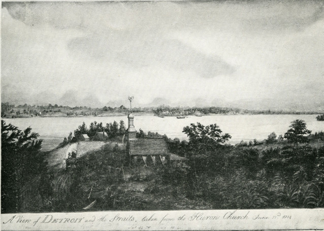
However, it didn't always look this way. This book began life with a different title and a vastly different cover concept, using this image:

For anyone who hasn't read Ghost Road yet (PS you will enjoy it, so come in and pick up a copy!), this 19th-century image of Detroit and the Straits from the Huron Church certainly makes sense with the content of the book, which spans Windsor, Essex County and the Detroit area from the 18th through to the 21st century. However, there was something about the image that just didn't reflect the historical variety in Gervais' stories.

Ghost Road not only went through a few covers but several possible titles as well. With the final title Ghost Road came a new image and new direction for the cover. Marty, an accomplished photographer as well as a writer, provided the photo of the ghost road itself, a strip of abandoned drag racing road from the 1960s and '70s, now overgrown and hidden by farmers' fields.

I decided to take a more contemporary approach to the cover, and, inspired by the circular motif of the single tire, came up with this:

While I liked this design a lot, with the slightly feathered edges of the text giving it a slightly ghostly feel, the rest of the Bibliostaff agreed (and once they mentioned it so did I) that this version didn't look like a work of non-fiction; it had more of the aesthetic of a novel or short stories collection, and that could be misleading to the prospective reader.

This design was certainly getting closer though, and so I borrowed the circular motif, feathered texture, and of course the photograph, and combined them into what would become the final cover design for Ghost Road. I echoed the tire in the teal circle that holds the title (a similar teal to the Rumrunners cover, the companion book to Ghost Road). To balance the contemporary design elements and give a nod to the book's historic content I went with quite traditional fonts, Academy Engraved and Georgia, and altered them to suit the shape of the circle. After a good deal more fine tuning, and the blessing of Dan and Marty, Ghost Road had a cover. Tada.


While this particular book didn't go through a large number of different cover designs, some books take a few more tries before a suitable design is reached.

With Nadine McInnis' book, Blood Secrets, the initial idea was to go with an image of clothes drying on a washing line, to reflect some of the imagery in the title story.


Another concept was to use an image of peeling wallpaper. After dozens of different wallpaper options, some grungier than others, there was still something about this cover concept that was not quite working for the book.

When I started at Biblioasis, I was offered the chance to take a look at the Blood Secrets cover and see what I could come up with. My first offering drew from the prominence of hospitals and other care facilities in the book:


Yes, a bland and boring looking plate of hospital food. We quickly realized that while the layout and type treatment were working quite well, the image was so completely unappealing that it might turn the readership off the book. Bad sign.

So I tried this:
Still hospital themed, still a similar type treatment, but without the lunch meat. What stood out to me about this photo was its linearity and the strong contrast offered by the red panels. However, with the input of the rest of the Bibliostaff, it became clear that it also was more generally suggestive of minimal urban architecture than specifically of a care facility. I was moving a bit too far away from the manuscript with this one.

Anyone who has picked Blood Secrets will recognize this cover, the final outcome of the cover design process: a hospital window with curtains overlooking an outdoor scene that can read as quite hopeful or quite bleak depending on your view. To match the curtains and sky, I changed the background colour, and, as in the red panel version, added "stories" to the title of the book. Nadine felt this one was a lot more reflective of her book, and we all agreed it was a lot more appealing than a hospital dinner.