The sun was pouring into the bookshop yesterday and beckoning me out of the back office into the front of the shop to enjoy a little bit of vitamin D. That also meant I had some time to look around for content for the next installment of our Book Spotting series, where I provide commentary and praise for the best book designs currently in store.
Andy Warhol Screen Tests by Callie Angell (Harry N. Abrams 2006)

Today, I'll start with a book that I've been meaning to talk about for months now. Ever since it first came in (it is a used copy), it struck me as a powerful cover. I put it on display almost immediately. Obviously, the photograph itself is quite engaging, with the direct eye contact and stark black and white. For this reason, the simplicity of the rest of the cover really works. The red provides a strong contrast and the clean block text is clear and bold but doesn't compete with the photograph for the viewer's attention. Plus, there's tonnes of the red equivalent of white space, and we all know how much I like white space.
John Saturnall's Feast by Lawrence Norfolk (Bloomsbury UK 2012)
Sorry for the slightly blurry photo on this one. Clearly I was just too excited about the cover and couldn't keep my hands still. This cover at first glance seems to be the opposite of what I usually praise: minimal, clean, stark. The winding branches of the tree, the detail in the grasses, and even the throw-back style of the lettering, which has a slightly eroded look, should contribute to this cover feeling overwhelming and over the top, but it doesn't. The black and white saves it. High contrast silhouettes on a plain white background take this cover from distracting and confusing to crisp, clean and eye-catching.
First Novel by Nicholas Royle (Jonathan Cape 2013)
This book just arrived and it grabbed my attention as soon as I walked out into the shop yesterday. I'm a fan of books that find unusual ways to incorporate the title on the cover but I find that they can often get confusing or difficult to decipher. This cover escapes that trap by ensuring that the only major text on the cover is the title and the author's name. In fact, we get the title and author's name six times over. However, at first glance, my reaction was to wonder where the title was. That half-second hesitation drew me into the cover, into its clever and meta use of book spines. The car and plane infiltrating the line of spines gives the cover personality despite the plain serif type on the spines that lend it clarity.
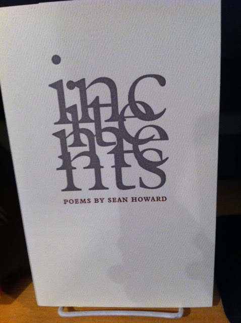
incitements by Sean Howard (Gaspereau 2011)
More beautiful books, as expected, from Gaspereau. This one actually reminds me of a chapbook I designed for a creative writing class while at university. What happens to letter forms when you overlap them? They become less about letters and more about the letter forms. Sure, if you look closely, you can read the title, incitements, in the graphic on the cover. However, it seems less important that you can read the title and more important that the use of lettering is visually interesting. Yes, the title is the most important thing on a book cover (most of the time?) and I am all for legibility, but if you are going to have a difficult to decipher title, this is the way to do it: making the letters themselves the art. Plus, you've got a title page for anyone who gets too confused, right?
That's all for today's adventures in Book Spotting. More to come soon!


2 comments:
Best advantages of a law education you can sum up in two words: self-employment. This gives you greater freedom and more flexibility in deciding which direction you want to take your interest. Thanks for sharing...
top journalism colleges in delhi
mass communication colleges in new delhi
This is cool!
Post a Comment