I judge books by their covers. By their type design. By their choice of cover image. By their use of colour and line. Call me shallow, but what a book looks like strongly contributes to whether or not I will pick it up, read the back cover copy, flip through its pages, and ultimately buy it.
I would argue that many if not most people, despite whatever adage instructs us to the contrary, do the same. And that's not necessarily a bad thing. However, what it means is that book designers need to create the right impression with their covers. And this can be a lengthy process.
Take, for example, Marty Gervais' recent Biblioasis book Ghost Road and Other Forgotten Stories of Windsor, which looks like this:
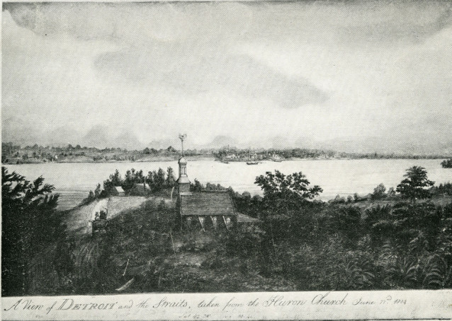
However, it didn't always look this way. This book began life with a different title and a vastly different cover concept, using this image:
For anyone who hasn't read Ghost Road yet (PS you will enjoy it, so come in and pick up a copy!), this 19th-century image of Detroit and the Straits from the Huron Church certainly makes sense with the content of the book, which spans Windsor, Essex County and the Detroit area from the 18th through to the 21st century. However, there was something about the image that just didn't reflect the historical variety in Gervais' stories.
Ghost Road not only went through a few covers but several possible titles as well. With the final title Ghost Road came a new image and new direction for the cover. Marty, an accomplished photographer as well as a writer, provided the photo of the ghost road itself, a strip of abandoned drag racing road from the 1960s and '70s, now overgrown and hidden by farmers' fields.
I decided to take a more contemporary approach to the cover, and, inspired by the circular motif of the single tire, came up with this:
While I liked this design a lot, with the slightly feathered edges of the text giving it a slightly ghostly feel, the rest of the Bibliostaff agreed (and once they mentioned it so did I) that this version didn't look like a work of non-fiction; it had more of the aesthetic of a novel or short stories collection, and that could be misleading to the prospective reader.
This design was certainly getting closer though, and so I borrowed the circular motif, feathered texture, and of course the photograph, and combined them into what would become the final cover design for Ghost Road. I echoed the tire in the teal circle that holds the title (a similar teal to the Rumrunners cover, the companion book to Ghost Road). To balance the contemporary design elements and give a nod to the book's historic content I went with quite traditional fonts, Academy Engraved and Georgia, and altered them to suit the shape of the circle. After a good deal more fine tuning, and the blessing of Dan and Marty, Ghost Road had a cover. Tada.
While this particular book didn't go through a large number of different cover designs, some books take a few more tries before a suitable design is reached.
With Nadine McInnis' book, Blood Secrets, the initial idea was to go with an image of clothes drying on a washing line, to reflect some of the imagery in the title story.
Another concept was to use an image of peeling wallpaper. After dozens of different wallpaper options, some grungier than others, there was still something about this cover concept that was not quite working for the book.
When I started at Biblioasis, I was offered the chance to take a look at the Blood Secrets cover and see what I could come up with. My first offering drew from the prominence of hospitals and other care facilities in the book:
Yes, a bland and boring looking plate of hospital food. We quickly realized that while the layout and type treatment were working quite well, the image was so completely unappealing that it might turn the readership off the book. Bad sign.
So I tried this:
Still hospital themed, still a similar type treatment, but without the lunch meat. What stood out to me about this photo was its linearity and the strong contrast offered by the red panels. However, with the input of the rest of the Bibliostaff, it became clear that it also was more generally suggestive of minimal urban architecture than specifically of a care facility. I was moving a bit too far away from the manuscript with this one.
Anyone who has picked Blood Secrets will recognize this cover, the final outcome of the cover design process: a hospital window with curtains overlooking an outdoor scene that can read as quite hopeful or quite bleak depending on your view. To match the curtains and sky, I changed the background colour, and, as in the red panel version, added "stories" to the title of the book. Nadine felt this one was a lot more reflective of her book, and we all agreed it was a lot more appealing than a hospital dinner.


1 comment:
Good post; interesting evolution of examples.
Post a Comment